From my long experience as a “building painter”
and a coach on colours, I keep a few certainties deep in mind. As I am reluctant to
certainties, I call them my “recipes”.
Nevertheless, I noticed that no one was willing to consider them with such a casual approach
and that they even gave rise to some kind of interest.
So, here we are with a short series, … to apply
only if you like the colours.
Better choose a colour at day light instead of artificial lighting.
Actually, a colour that looks beautiful at day light is usually also beautiful at night,
when the opposite is wrong, most of the time.
And more, artificial lighting can be adjusted, which obviously is not the case for natural light.
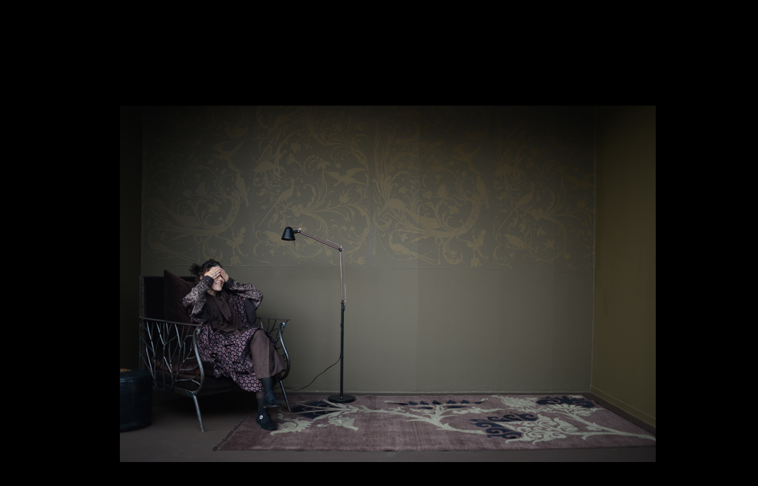
“Never paint a dark colour in a dark room”, they say …
But painting a dark room in white will never make it bright,
most of the time it becomes just more cold and sad.
So, I choose resignation to the idea of a dark room by enhancing
its ambiance and identity,
instead of trying in vain to make it brighter against its true nature.
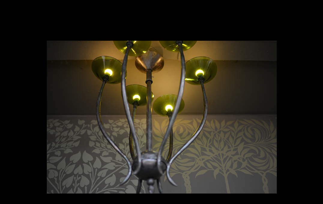
I prefer to paint the ceiling the same colour as the walls, be it is high or low.
Because what is more important in a room,
it is the proportions between the quantities of surface of the different colours.
As the windows, the doors and the floor occupy a big part of the space,
the colour of the walls resuls too often not dominant enough, it does not inhabit the space properly.
If the ceiling is painted in another colour, even neutral, the whole place is messy,
just an addition of small surfaces.
And then, finally, it is not by appealing the eye by another colour that you can change a ceiling that is too high or too low !
If I want to underline the importance of a door, I paint it in a neutral colour.
A grey that comes close to the colour of the walls to keep neutral,
defying the rule that says that a colour placed in the middle of another turns to the complementary colour of the other colour,
which would mean pink frames in the middle of green walls, for example…
ABOUT THE ART OF UNMATCHING COLOURS :
My mother always made fun of the “provincial girls” who do not go out without the gloves matching the bag and the hat. I do not think for a moment to imitate her and I even hope that this kind of talk is out of date. On the other hand, this remained to me : I do not like the gloves matched with the bag and the hat either. These rather frivolous considerations hide deeper ideas that are the product of long practice, and that is why I tend to regard them as commonplace. But as almost every confrontation shows me that these places are not so common that it seems to me, they deserve some consideration.
I built the collections of colours, tiles, paints, velvet, voile and organdy, linen … without worrying about “matching” them. These are very different materials, one from the other, and each has its logic. Moreover, their use is often different too, which puts them in a different position with respect to the light. For example, linen will be mainly used as a curtain and it is therefore necessary that the colour remains interesting against the light, the organdy will often be used for its transparency and the landscape must be bearable behind this veil of colour; the paint must be able to be used on walls and ceilings, so large surfaces, without being too present, … The reasons for not transposing a choice of colour from one material to another are very numerous and have therefore justified a specific approach to each new subject. It may even be possible that some of these colours clash with others.
Most certainly, I have always sought to find an overall harmony between the different collections, but I have never discarded a colour that seemed to me exquisite for the benefit of harmony, because I often use what I call a “tension” between colours rather than provoking by simply saying that they clash. Because, like many other aspects of life, it’s all about proportion. Too many colours in harmony are tiresome and crush the imagination, while introducing a slight tension awakens interest. So, it does not seem to me a good recipe to match the gloves with the bag and the hat. And anyway, with regard to the spaces of life that are our purpose, life is usually very well responsible for introducing the tension into a world of harmony too artificially composed by decorators or frequent readers of decoration magazines.